Mastering color schemes for surface pattern design

It goes without saying, but surface pattern design is a creative field that relies heavily on aesthetics and visual appeal, non more so than using surface pattern design color schemes.
Choosing the right surface pattern design color schemes and understanding how they interact is essential.
Without it, surface pattern designers would be at a miss when trying to create captivating and harmonious patterns.
In this article, we will explore the world of color schemes for surface pattern design and provide insights to help you master this aspect of your creative process.
But first, a quick summary of the article.
- Understanding color schemes for surface pattern design - Primary, secondary and tertiary colors all play a crucial role, so understand the balance is key
- The balance of color schemes in surface pattern design - A experienced surface pattern designer will have an eye on what color schemes work in each pattern
- The popular surface pattern design color schemes - Monochromatic, analogous, triadic are but a few popular surface pattern design color schemes
- The process for creating surface pattern design color schemes - Moodboarding, testing and researching will all give designers the confidence to create better color palettes
Now that’s out the way.
Let’s dive in further.
🤔 Understanding Color Schemes
Before diving into the intricacies of color schemes, let's establish a basic understanding of colors.
Colors can be broadly categorized into three main groups:
The combination of which is important for creating color schemes for surface pattern designers.
Primary Colors
Primary colors are the foundation of all other colors.
They consist of:
- Red
- Blue
- Yellow
These colors cannot be created by mixing other colors together; instead, they are used to create all other colors on the color wheel.
Secondary Colors
Secondary colors are created by mixing two primary colors.
The three secondary colors are:
- Orange (red + yellow)
- Green (blue + yellow)
- Purple (red + blue).
These colors lie between the primary colors on the color wheel.
Many designers would argue that mastering these colors are key for any surface pattern designer creating the best color scheme.
Tertiary Colors
Next up, tertiary colors are formed by mixing a primary color with a secondary color.
The resulting colors have names like:
- Red-orange
- Yellow-green
- Blue-violet
Tertiary colors provide a wide range of possibilities for creating complex and nuanced color schemes.
As you can see, each set of colors is a gradual progression of the previous set.
Understanding this balance and the process is important for surface pattern designers building up color schemes and color palettes.
It’s a process, with one part leading to another.
Warm and Cool Colors
Colors can also be classified as warm or cool.
- Warm colors, such as reds, oranges, and yellows, evoke feelings of energy, passion, and vibrancy.
These tend to be used in warmer summer months on garments and decoration, with the opposite true for cool colors.
- Cool colors, like blues, greens, and purples, create a sense of calmness, tranquility, and relaxation.
Understanding the emotional impact of warm and cool colors is crucial when designing surface pattern color schemes.
Being an accomplished surface pattern designer, means understand how and when to use all these colors, in what combination in your surface pattern design color scheme.
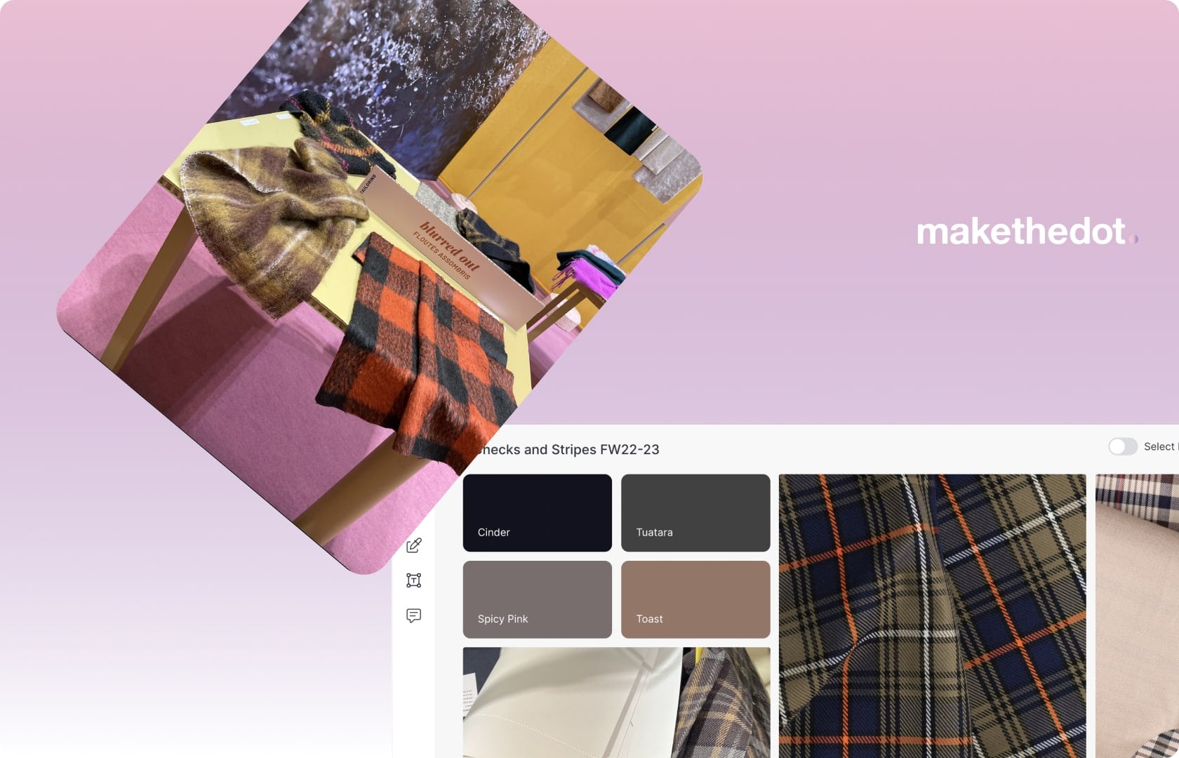
Checkout our built in color libary and color picker feature here.
💡 Importance of Color Schemes in Pattern Design
Color schemes play a vital role in pattern design as they directly impact the overall aesthetic and visual impact of a design.
Obviously…
So mastering the how to create the best color schemes and balance the types of colors is key for surface pattern designers.
Here are a few reasons why mastering color schemes is crucial for surface pattern designers.
Later we’ll share a few tips on how to create the perfect surface pattern design color schemes.
Creating Visual Harmony
A well-executed color scheme can create visual harmony in a surface pattern.
By carefully selecting colors that complement each other, surface pattern designers can achieve a sense of balance and cohesion.
Harmonious color schemes make patterns more visually appealing and pleasing to the eye.
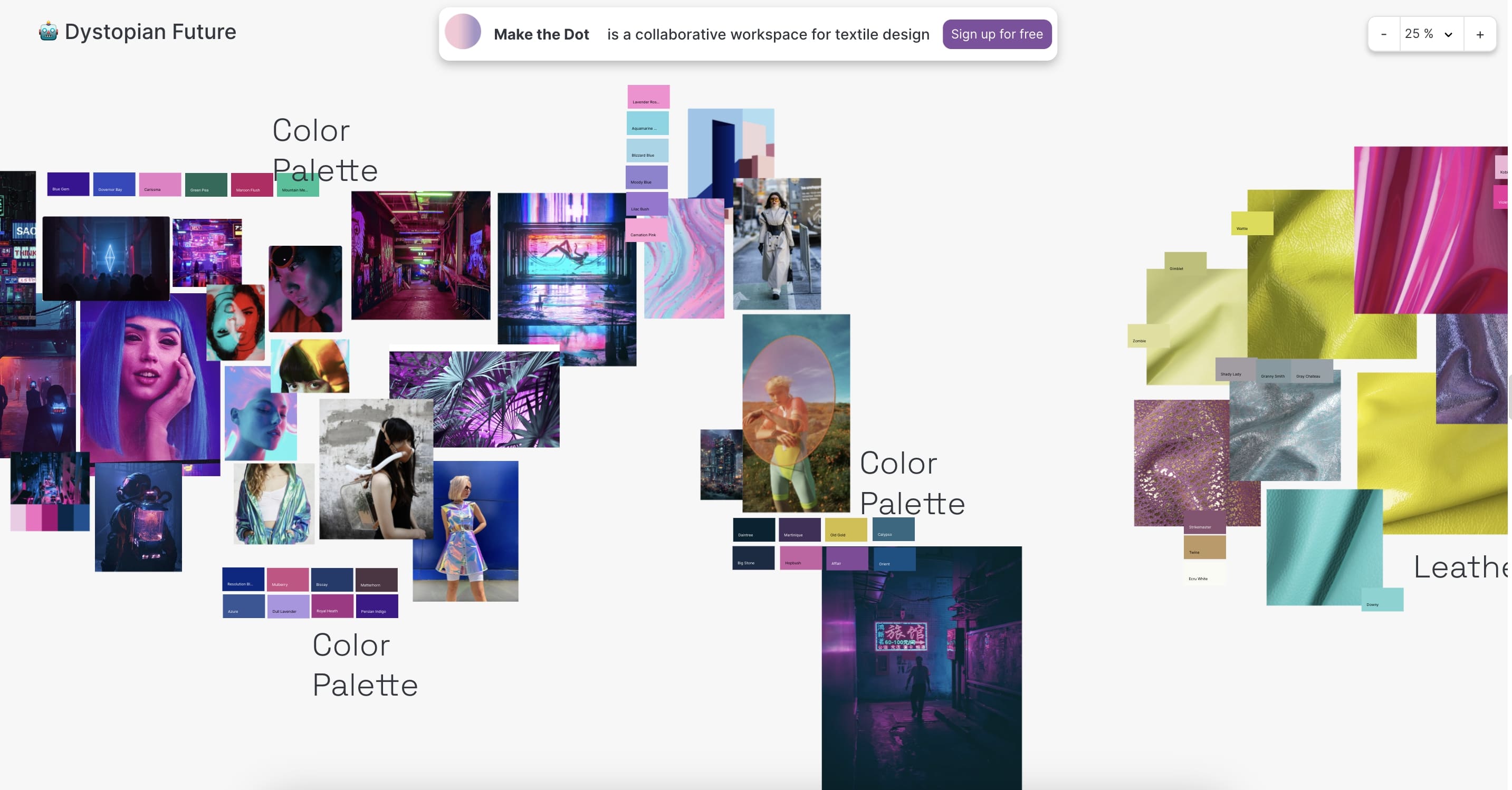
Checkout our moodboard template for acid vintage color schemes.

Setting the Mood and Atmosphere
Colors have the power to evoke specific emotions and set the mood of a design.
Different color schemes can create vastly different atmospheres.
For example, a pattern with warm colors might feel energetic and inviting, while a pattern with cool colors can evoke a sense of serenity and tranquility.
This surface pattern design color scheme may play into the overall theme of the print pattern.
Understanding the mood and atmosphere you want to convey is essential in choosing the right color scheme.
Checkout our moodboard template for surface pattern design color schemes.
Enhancing the Design's Message
Colors can enhance the message or story behind a pattern.
They can reinforce certain themes, evoke cultural associations, or communicate specific concepts.
For example the Day of the Dead print pattern theme below uses traditional colors from Meso-america like turquoise, oranges and greens.
All traditional colors in that region and for that theme.
By utilising color schemes effectively, designers can ensure that the colors used in a pattern align with its intended message and purpose.
Therefore ensuring the surface pattern design color scheme helps convey the overall visual story.
Popular Color Schemes for Pattern Design
Now that we understand the significance of surface pattern design color schemes, let's checkout some popular color schemes commonly used in pattern design.
Monochromatic Color Scheme
The monochromatic color scheme involves using different shades, tints, and tones of a single color.
For surface pattern design color schemes using this method these can be used on textiles and clothing quite well.
This creates a cohesive and harmonious pattern that relies on variations in lightness and darkness for visual interest.
Monochromatic color schemes are elegant and sophisticated, providing a sense of unity to a pattern.
Surface pattern design color schemes using this method tend to be the most popular and versatile.
Analogous Color Scheme
An analogous color scheme involves using colors that are adjacent to each other on the color wheel.
Ie. a surface pattern design color scheme using orange and yellow.
This creates a harmonious and visually pleasing effect, with subtle but noticeable changes in variation.
Analogous color schemes are often found in nature and can evoke a sense of tranquility and balance.
Checkout the color scheme in this surface pattern designers moodboard template.
While still providing enough contrast to pop to the naked eye.
Within the textile industry surface patterns using these color schemes are seen less frequently today.
Complementary Color Scheme
A complementary color scheme involves using colors that are opposite each other on the color wheel.
This creates a high-contrast and dynamic effect, making the colors "pop" and stand out.
Bright, bold, and very much in vouge in 2023 surface pattern design color schemes.
Evoking looks and fits of the 90s, back today.
Complementary color schemes can create a sense of energy and vibrancy in a pattern.
These have been seen more and frequently in the fashion industry today.
Triadic Color Scheme
A triadic color scheme involves selecting three colors that are evenly spaced on the color wheel.
Surface pattern designers using this color scheme create a balanced and vibrant pattern.
Triadic color schemes offer a wide range of color combinations and can create a visually striking design.
Incredibly versatile, and becoming more popular in the textile industry.
Tetradic Color Scheme
Last but not least, tetradic surface pattern design color schemes.
A tetradic color scheme involves using four colors that are evenly spaced on the color wheel.
This provides even more color variation and possibilities.
And by default, more variations for surface pattern design colors.
Tetradic color schemes can be challenging to balance, but when executed well, they can create visually rich and captivating patterns.
Another loud vibrant surface pattern design color scheme evoking the 80s, we are seeing more and more in garments today.
Checkout our blog on how to use these color scheme in fabrics and textile assortments.
Applying Color Schemes to Surface Pattern Design
Now that we have explored various colors, let's look a little more into how to apply them when creating a surface pattern design color scheme.
Choosing a Dominant Color
When designing a surface pattern, it is essential to select a dominant color that will be the focal point of the design.
This color will be the most prominent and will set the overall tone and mood of the pattern.
Choosing a dominant color for a surface pattern design color scheme requires considering the desired impact and emotional response you want to evoke.
Selecting Supporting Colors
Once the dominant color is chosen, it's time to select supporting colors that will complement and enhance the design.
Careful consideration should be given to the intensity and contrast of the supporting colors to ensure a visually balanced pattern.
Accents should provide contrast and enhance the primary color with the pattern.
Balancing Color Intensity and Contrast
Creating a pattern using surface pattern design color schemes most importantly means balancing color intensity and contrast.
Some colors naturally draw more attention, while others recede into the background.
A surface pattern designer needs to adjust the intensity and contrast between colors in the surface pattern design color scheme.
With the goal of guiding the viewer's eye and create a sense of depth and dimension in your pattern.
Particularly important if the pattern is on a piece of apparel of fashion items.
Experimenting with Color Variations
When creating a surface pattern design color scheme experimentation is key.
A designer shouldn’t be afraid to experiment with different variations of colors within a chosen surface pattern design color scheme.
- Lightening or darkening colors
- Adjusting saturation
- Adding subtle variations
All can add complexity and visual interest to your surface pattern.
Embrace the creative process and explore different possibilities.
Every experiment should be seen as a success, leading the designer closer to the end goal.
Tips for Mastering Color Schemes in Pattern Design
Mastering color schemes requires practice and a deep understanding of color theory.
Here are some tips to help you on your journey, from our community of surface pattern designers.
Start with a Mood Board
Creating a mood board with colors and visual inspirations can provide a solid foundation for your pattern design.
Collect:
- Images
- Color swatches
- Patterns
That resonate with the mood and atmosphere you want to create.
This will help you develop a clear vision for your surface pattern design color scheme.
Checkout out blog on how to create a surface pattern design moodboard for more insight.
Consider Color Psychology
Colors have psychological effects on individuals, and understanding these effects can help a designer create patterns that resonate with the intended audience.
Research the meanings and associations behind different colors.
And incorporate them strategically into the design to evoke specific emotions or convey particular messages and themes.
We’ll be writing a more comprehensive blog on color theory for surface pattern design color schemes later on.
Test Color Combinations
Before finalizing your color scheme, it's essential to test different color combinations.
Experimentation is a key part of creating surface pattern design color schemes.
Create small swatches or digital mock-ups to see how colors interact with each other.
Some color combinations may clash or create unwanted visual effects, while others may harmonize beautifully.
Experimentation will help you identify the most successful combinations in the surface pattern design color scheme.
Use Color Theory Resources
Color theory is a vast field with numerous resources available to deepen understanding and application.
- Books
- Online courses
- Tutorials
Can provide valuable insights into:
- Color schemes
- Color harmonies
- Techniques
For creating visually appealing patterns.
Continuously educate yourself and stay updated on current trends and techniques.
Conclusion
Mastering surface pattern design color schemes is a crucial skill for pattern designers.
By understanding the principles behind different color schemes and their impact on visual aesthetics and emotions, a designer can create captivating and harmonious patterns.
Starting with a clear vision, experimenting with different color combinations, and utilize color theory resources to will expand a designers knowledge, and make them a better artist.
With practice and experimentation, a surface pattern designer will develop a keen eye for color and elevate their pattern designs.
For more info on the surface pattern design techniques and skills, read our blog on the subject.
FAQs
Q1. How do I choose the right color scheme for my pattern design?
When choosing a color scheme, consider the mood, message, and atmosphere you want to convey. Experiment with different combinations and consult color theory resources for guidance.
Q2. Can I use more than one color scheme in a single pattern?
Yes, you can combine different color schemes to create complex and visually dynamic patterns. Just ensure that the colors harmonize and enhance the overall design.
Q3. Are there any tools available to help me select color schemes?
Yes, there are several online tools and applications that can generate color palettes and suggest harmonious color combinations. Some popular ones include Adobe Color and Coolors.
Q4. How can I ensure my color scheme is accessible for individuals with color vision deficiencies?
Consider using color contrast analyzers to ensure sufficient contrast between colors. Additionally, you can provide alternative color schemes or patterns that are more accessible to those with color vision deficiencies.
Q5. Can I break the traditional color scheme rules and create my own unique combinations?
Absolutely! While understanding color theory and traditional color schemes is essential, don't be afraid to experiment and create your own unique color combinations.


The Background and Story of Why we Started Make the Dot

What Gen-Z Means for Fashion Brands and Consumers